A white wood floor without pink undertones, is it possible?
In most design professions, color is not a characteristic that goes unnoticed In fact, it is one of the most critical attributes when you are using wood in the design of your project. WoodCo, observes the study of color theory when sharing our wood products with customers to ensure the maximum potential of our products beyond the construction details!
The Story:
A customer came into our design center with a crisis: A desire for a white floor that did not have a pink undertone. Our team set to work showing off several of our white hardwood flooring options, but every product we presented was viewed as pink by our customer. After reflecting on our design knowledge, we realized this problem could be solved by color theory application.
But why is all this science important when it comes to choosing your wood flooring?
Why did this happen?
The white woods were placed next to orange toned woods when viewed. (The surrounding colors can play tricks on our eye, making us visualize colors and shade slightly differently; Color Theory at work!) Also, the client was so worried about seeing any type of pink in the wood that her mind was looking for the pink color. Sometimes our mind can make us see things that are not there. How can we solve this issue?
By changing the colors around the wood, it helps our eyes visualize different colors. By having orange tones next to white wood, it makes the orange, pink, red tones stand out more. By changing the colors next to the wood, we can mute out the pink tones
The fundamentals of applying color theory may be applied by observing the combinations of Primary, Secondary, and Tertiary colors. These combinations allow you to mute a color that is reflecting off an object while exposing a color that isn’t as noticeable.
When helping our client that was seeing pink tones in the wood, we took a WoodCo favorite, despite the reflection of pink undertones, and staged inspiration objects on the plank for possible colors that she may implement in her space to neutralize the color tones!
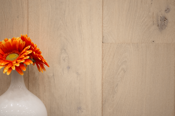
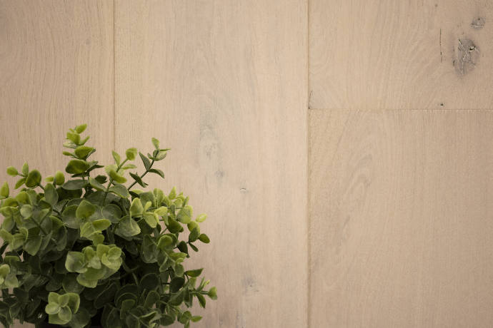
As a result, the left image appears warmer in color reflection. Where the right image, we see an example of a cooler color tone.
Conclusion.
We can see that by carefully choosing the paint, furniture, and accent colors in the space you can successfully mute out most of the pink tones found in wooden floorboards.
It’s important to note that, color is a perception which can vary from person to person, by understanding the theory behind visual perception, we can help our clients create a space that they will enjoy!